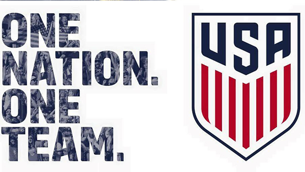
U.S. Soccer’s new crest revealed in unorthodox fashion as fans receive virtual-reality packs

Late Thursday night, U.S. Soccer teased the long-awaited arrival of its new logo with a brief video shot at its Chicago headquarters, then wiped clean the avatars on their various social-media accounts, leaving blank spaces where the federation’s quarter-century-old crest once featured.
— U.S. Soccer (@ussoccer) February 26, 2016
It was clearly a hint of the grand unveiling around the corner. But it soon seemed to be spoiled by the speed and efficiency of mail deliveries of USSF supporters’ club merchandise featuring the reworked badge, as gleefully shared by fans:
lol us soccer sent me a scarf with the new crest thanks @oliviaayyy5 pic.twitter.com/kyENwj5kpO
— syd ✌️ (@sydamintoast) February 27, 2016
Received a package from US Soccer that contained a scarf with the new crest(Album inside https://t.co/4qYs9bc9EH pic.twitter.com/uAnwst6dcn
— ⚽ The Cooligans ⚽️ (@SoccerCooligans) February 26, 2016
But as it turns out, it was all part of an elaborate marketing campaign intended to bypass traditional media and connect more directly with fans, as revealed to the New York Times. In the end, however, the logo matches the one reported months ago by FootyHeadlines.com.
The simplified look recalls the popular retro centennial crest worn by the senior national teams in 2013, on the occasion of the federation’s 100th anniversary.
 Gone are the four-cornered shield shape, three beveled stars and the high-flying soccer ball. (The latter has grown stale in the eyes of some fans and pundits, who joke about the upward trajectory suggesting a launched long ball or an aimless clearance.)
Perhaps more controversial than the new logo is the reported new U.S. Men’s National Team shirt, part of a predominantly black kit set to be revealed along with the crest. TodoSobreCamisetas.com and FootyHeadlines.com posted similar leaked images of the new shirt on Wednesday:
https://www.youtube.com/watch?v=4sbxSPUdwi4
The shirt will apparently be worn with black shorts and black socks as the USMNT’s second-choice kit at the much-anticipated Copa America Centenario tournament, which takes place across the United States this summer.


